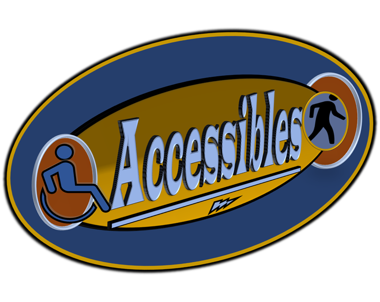
My client is planning on opening a gym helping people with disabilities to build their confidence and strength through exercises. They had an idea that they had created in powerpoint that they wanted me to convert into a more useable file type and also improve to make it look more professional.
All of the elements were important to include, though we worked together on the best way to include them so they worked as one image rather than appearing too busy and like multiple images just put together. In the final design some elements were removed, like the circles behind the people, and the font changed.

The initial design went through multiple steps, trying different ideas and working out the best way to include all of the elements that they wanted and the layout for this. I then added the 3D element that was in the initial design with a black outline to make the logo stand out as they wanted.
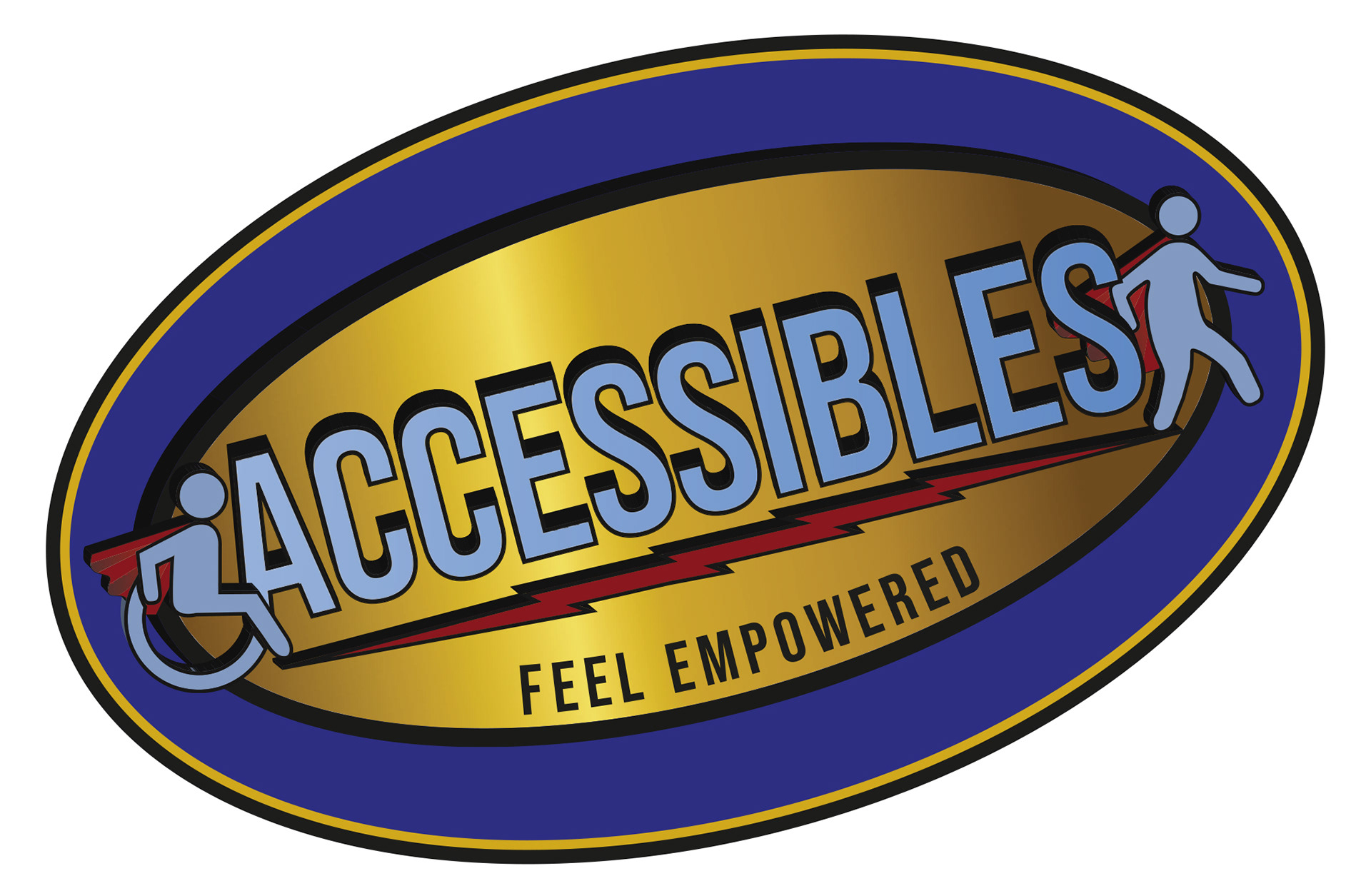
I think the final design works well, it includes the elements from the original and will work in the context of the project. The idea is for it to produce a sign for the gym and the angle was an important part of the concept to the client, the lightning works as both steps to show the journey and as a nod to the superhero theme along with the capes on both figures. It will also likely be used on a uniform on a black polo shirt and the design stands out well on a black background, which was an important part of the brief.