This was another magazine article design for the City Pulse digital magazine for Smart Cities and Technology.
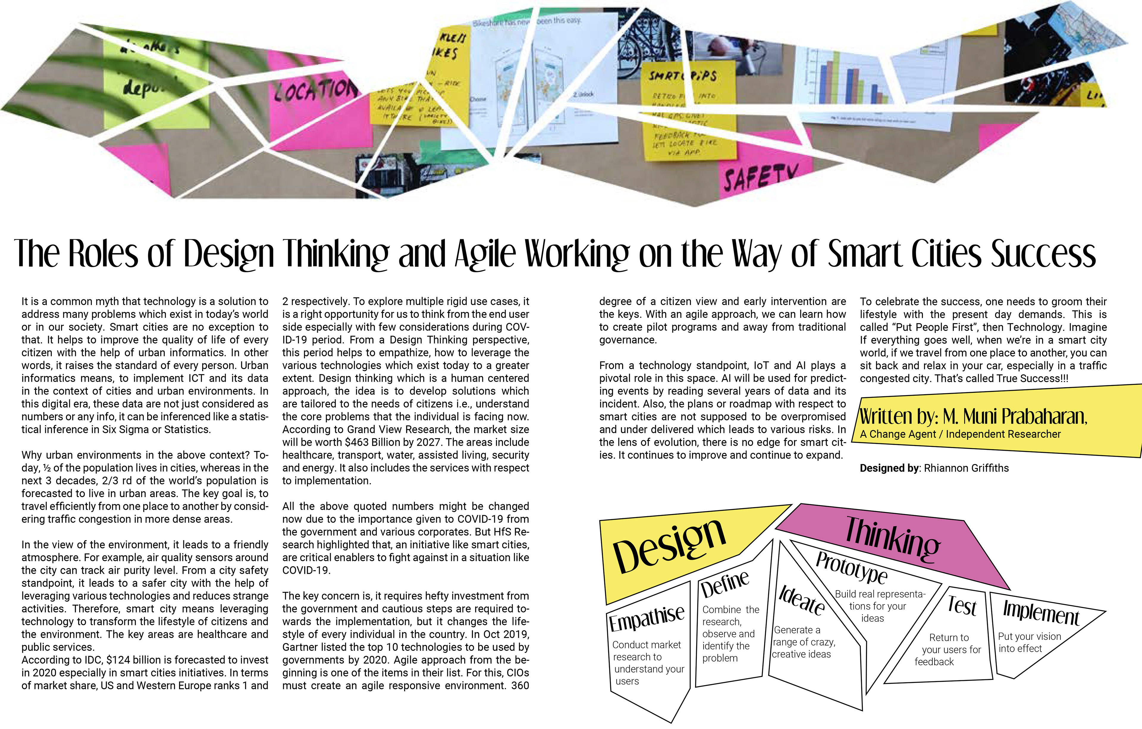
Although with this design I had an initial idea, I did end up playing around with the layout and the best way to show aspects of the design. One of the main things I felt needed to be added to the original text was an explanation of what Design Thinking is as this may not be something that people within the technology industry or casual readers interested in the subject would have previous knowledge of. I wanted to include this as part of the design to make it more interesting, rather than just include it as more words.
The initial design had the Design Thinking part of the article on the bottom right, though this made it appear more of a block of text on the left and not that balanced. I used colours from the image used at the top for the design to tie the spread together
The second idea used the same images but moved the one aspect fo the design. I feel this one is more balanced, but the Design Thinking section still looked a bit squashed and didn't fit with how I imagined the design to look.

The third design included aspects of the Smart Cities side of the article, after feedback that I had concentrated solely on the Design Thinking and it may not tie in with the rest of the magazine. I tried this at the bottom to see how it would work, maybe balancing out the original layout for the Design Thinking section but this felt squashed to me.

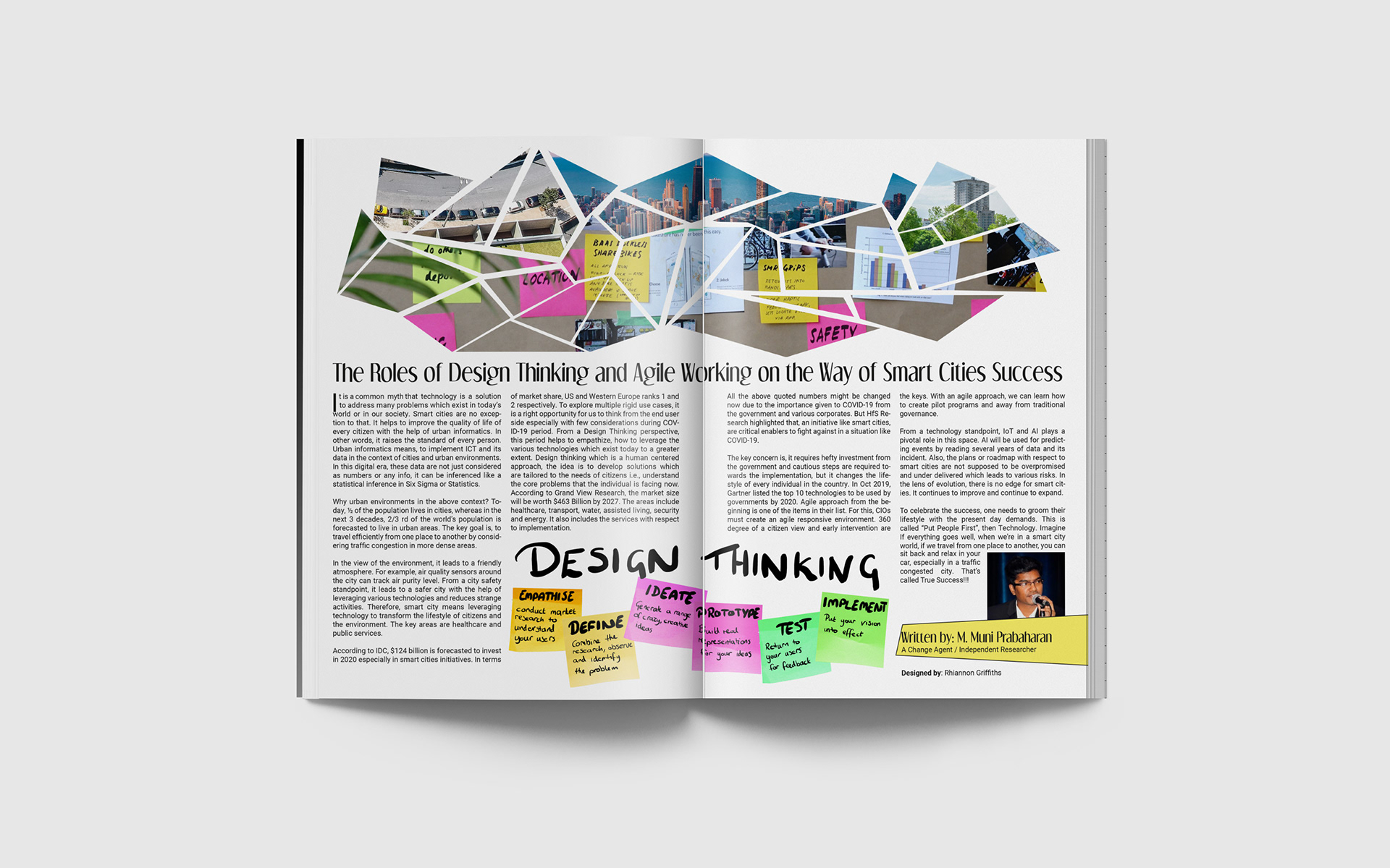
In the final design I used hand drawn elements for design thinking. I used post it notes I found in a royalty free image and used a tablet to write the words on there. I thought this worked well to link it to the original image I used at the top of the page. I found some more city images and added these around the image at the top, but kept the shattered style for it so it tied in with the original image and didn't look just stuck on there.