I was asked to use my existing work on a digital magazine and the old guidelines to create a new version of the guidelines for the layout of the magazine articles. It should be easy to understand and use for beginners to design as well as more experienced. I was asked to include the specific fonts and sizes as well as an outline of any guides needed that would be used to make the layout.
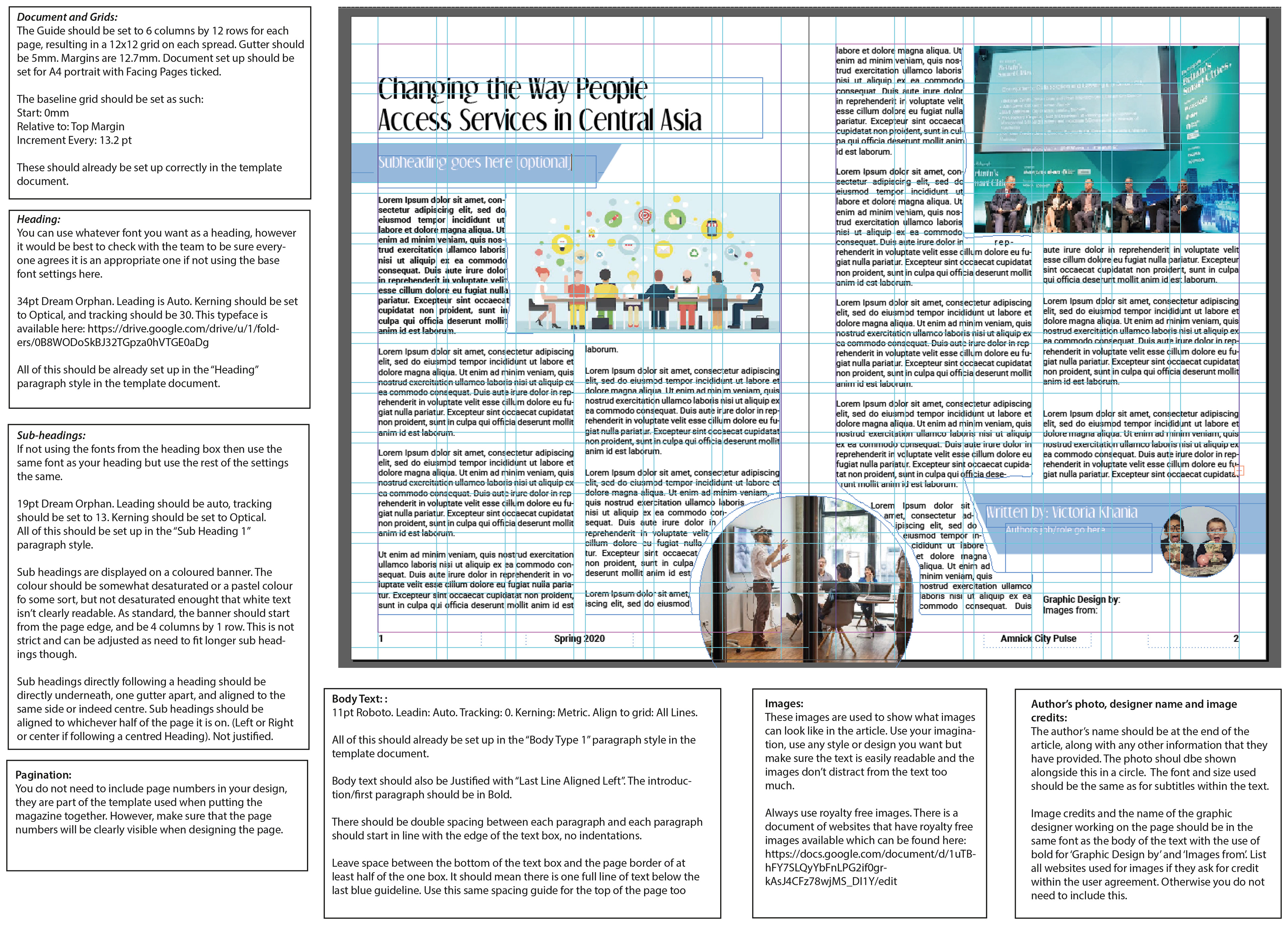
I used the information fro the last guide that was created as part of a team. It was originally created with the fonts and style used at the time, however this had changed for the new edition and they wanted a more modern and cleaner style that fitted the technology and future aspects of the magazine articles.
There are also parts in the original guidelines that referred to a template that is no longer available for the team.
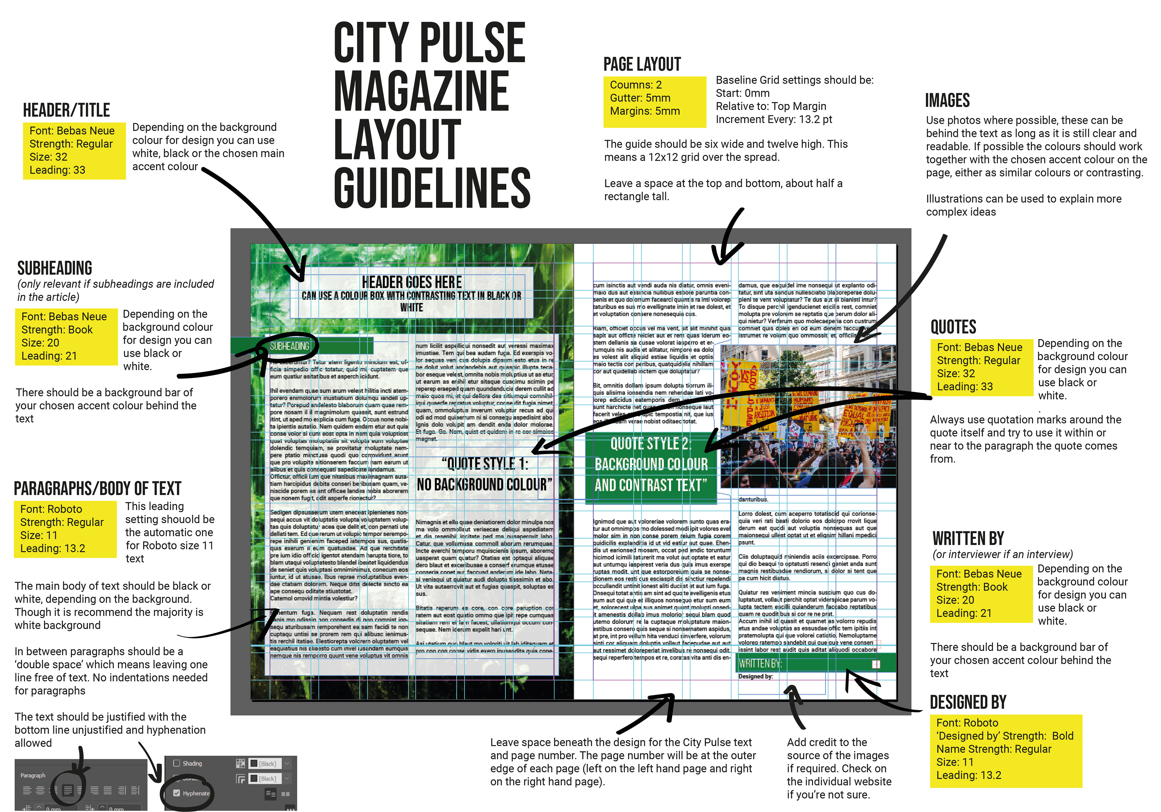
I think that the overall design is easier to understand than the original. It is also clear which fonts and sizes to use and the yellow boxes ensure that this information is easy to find for each section to refer back to in the future. I think that the arrows make it clearer which sections the rules apply to and the new design style fits the themes behind the magazine better.