The brief for this project was to create an editor's letter and an advert for the International Collaboration team that would work together on the pages side by side.
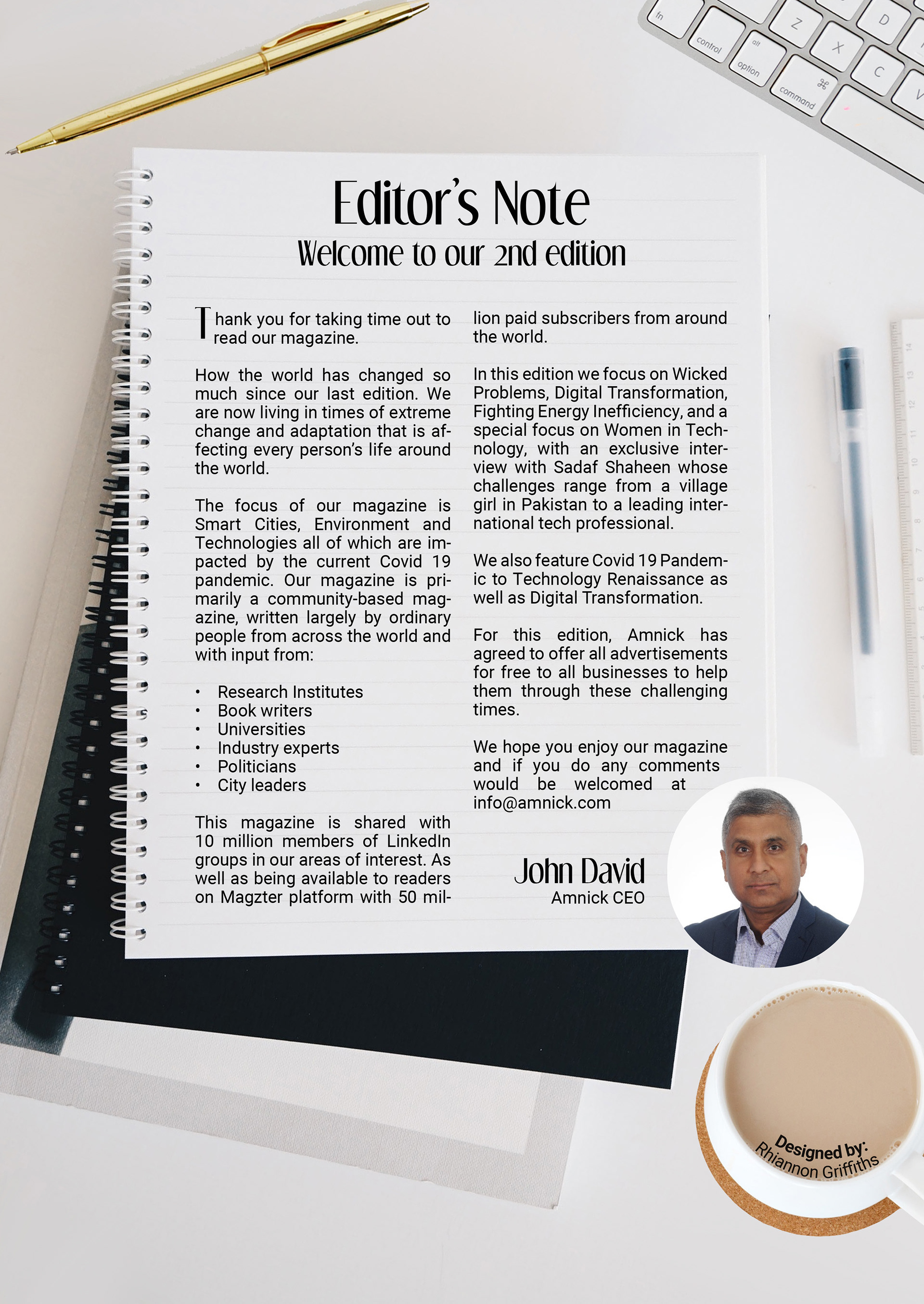
I designed the Editor's letter before I knew exactly what the other half of the project was going to be, going with the idea of a physical letter being written on a desk. As it is a magazine focusing on technology I wanted the desk to be modern, clean and uncluttered but to still be recognisable as a desk that could be used. Using light colours worked well and I found this image on Unsplash, before adding the pen and coffee cup to fill those empty spaces.
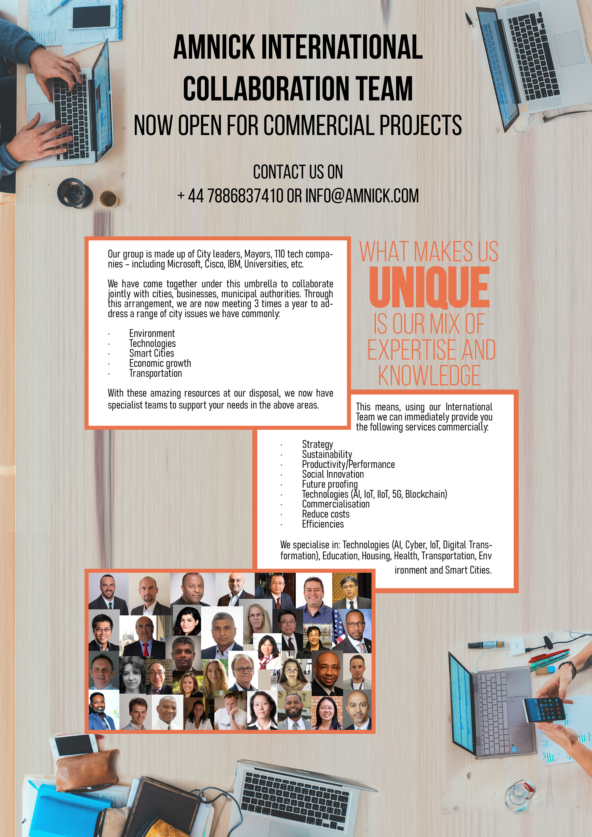
I tried to use the original colour scheme and went with the desk style for the one design, though I wasn't sure how well the photos of the team showed up. I tried playing around with a colour taken from the front cover of the magazine, which would still work with the colours in the editor's letter. I focused on the quote taken from within the text and made that the main part of the design.
The desk idea was chosen, but I like the other design, the space around the text and the simplicity of it from a distance. I also enjoy showing how different styles can be used to showcase the same information.

In the final design I like the way the two look next to each other, light and easy to read and the colours do work well together.
