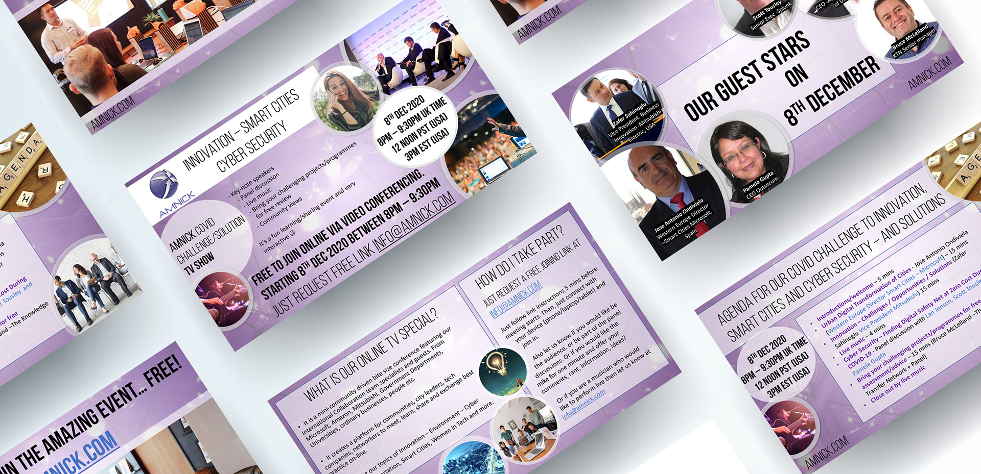
The brief for this project was to use some existing slides and to make them more attractive and easy to read. The original slides used a basic layout from Powerpoint and the whole project was designed within Powerpoint once the background image was created in Photoshop. The whole presentation is only 5 slides long so ensuring there was a link between them, and using similar shapes to the original design, was important.
The main background was designed using the company's logo and the colour palette used for the company's promotional material. An image to represent networks and connections was used in the background as well as the logo on a white rectangle in the top corner. Due to the size of the background image the same one was used on all slides and simply moved to remove the logo in the corner on the majority of slides.