This project was to design an image to be used by the Graphic Design Team at Amnick Social Enterprise to improve the social media presence, using the logo and information used in the team's brochure.
In the end there were three versions created, each one includes different information from the brochure and is done ins a style and size that should be readable on a variety of screens. The size decided on was 1028 x 1028, the size recommended for Instagram, and the font size means that even on phones the text should be readable, rather than making them text heavy
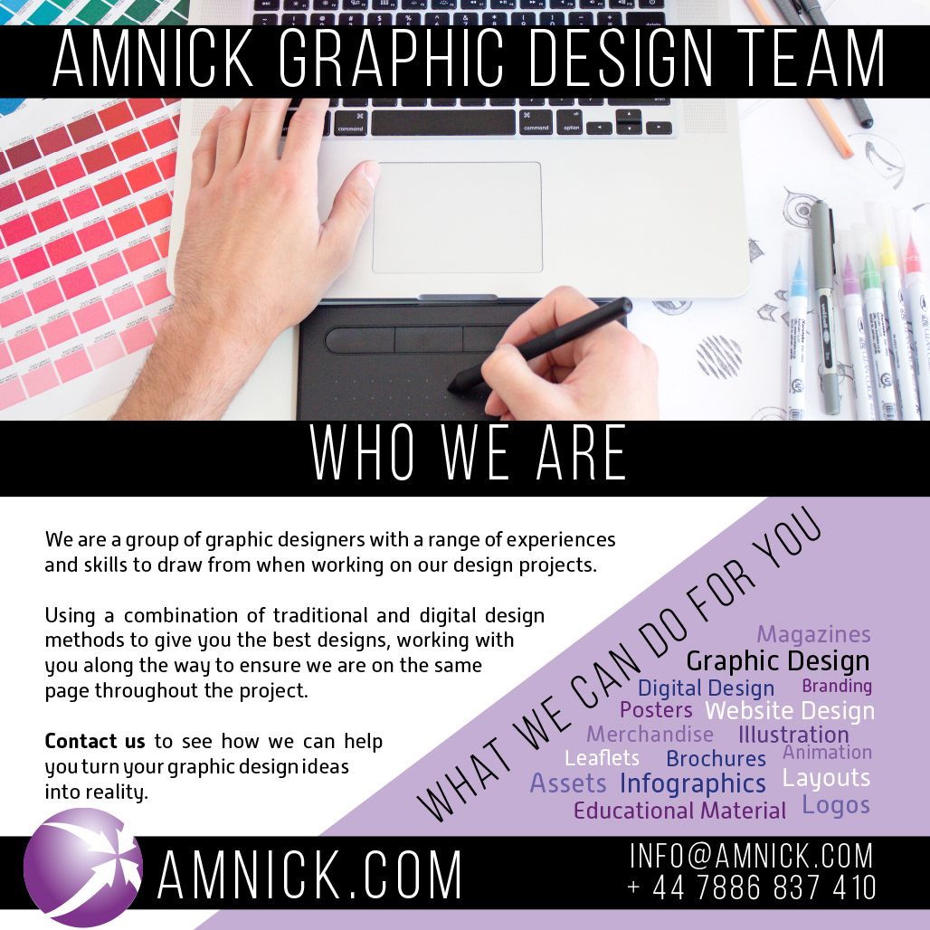
The first design includes both the who we are and what we can do sections from the brochure. This one is the most text heavy, but does use the style of the brochure that is already designed and means that all information is present.
The second design focuses on the services provided by the team. This means that they are clearer, more eye catching, and easier to read on a mobile device in different social media without having to zoom in. It's a simpler version of the design but does show the services offered rather than the introduction to the team.

The final design uses some of the information on the main project for the team, the smart cities magazine, that has been worked on the past two years. This is entirely designed by the team members and is a good showcase for the work that has been done so a link to this could be included in the text in some social media platforms.

Overall I feel that this project was successful. The designs are simple and eye catching enough to stand out on social media, they include information on the team and the services provided and stick to the theme and style used by the existing brochure. I would work on reducing some of the text on some of the designs, but as this is what was asked for in the brief I feel that it fulfilled that aspect, especially given the fast turnaround of the project.