As part of the marketing for my design business, I designed a quarter page advertisement to run in the magazine for the local Chamber of Commerce. The main reason I chose this size was the budget I had for the advert and that I felt I could fit the information needed in the space given.
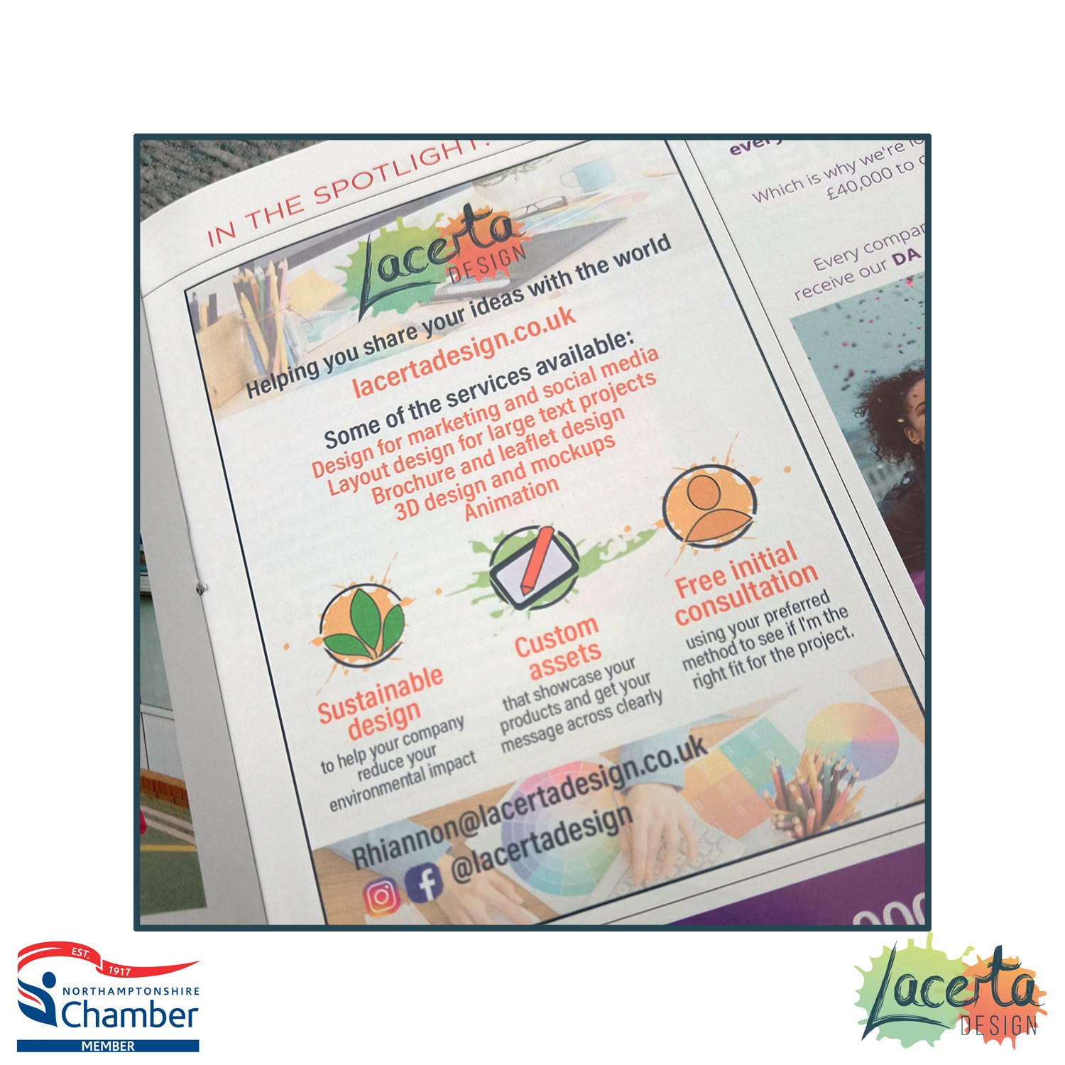
This is the final design when printed on the page of the magazine:
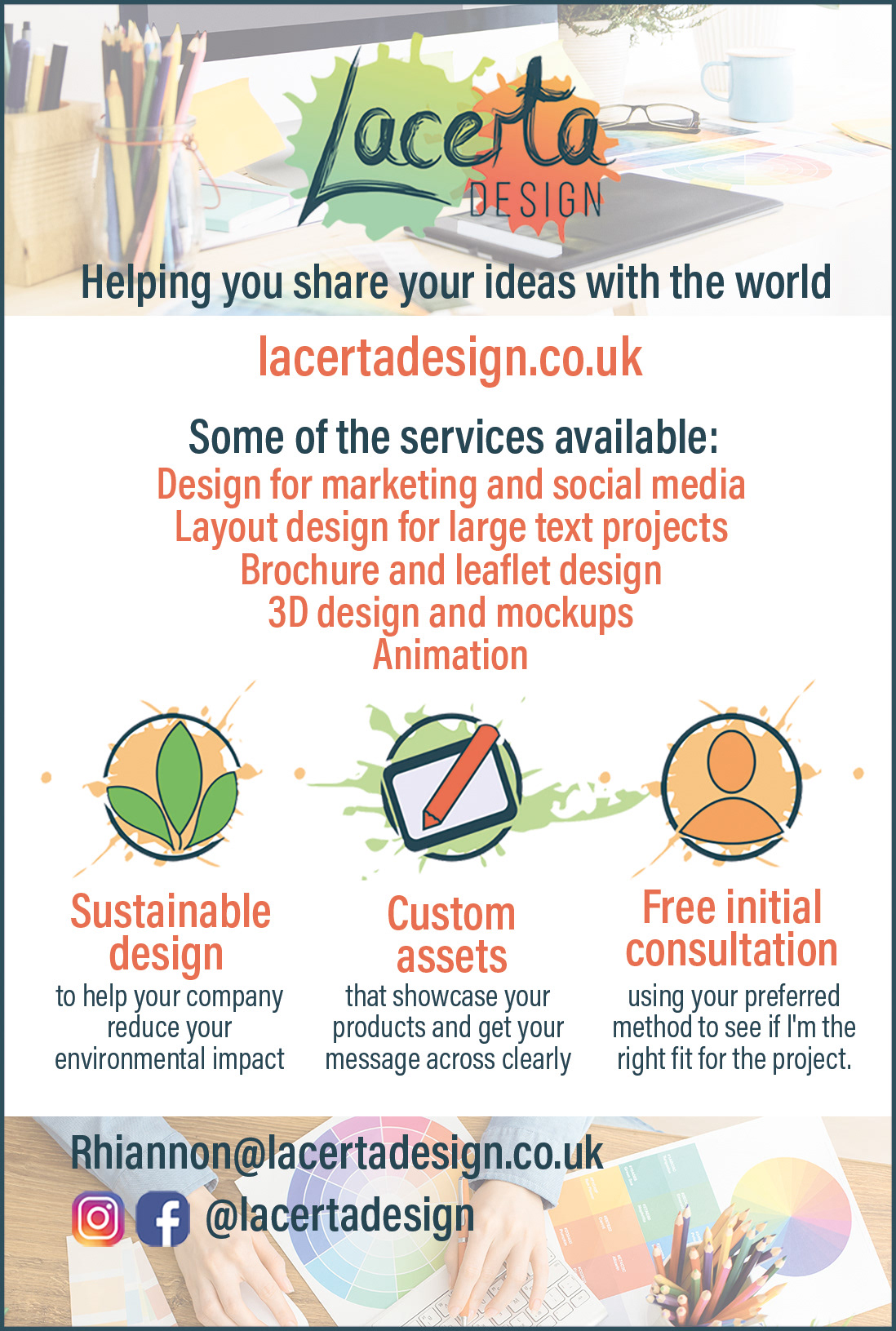
The initial design idea was to include elements that had been designed and used in the website. these were hand drawn using Illustrator and use the colour palette chosen for the company. This meant that all of the elements of advertising would work together and continue the brand identity that I had created for digital assets in the print versions.
I also used the royalty free images that I used within the various social media headers and advertising, keeping the colours bright and continuing the brand identity for clean designs with some colour and playfulness to them.
I did two variations of this with different layouts, one with the text at the top and the other at the bottom. I also moved the website URL to see where it fit best. I made sure to include the logo and tagline for the branding at the top of the advert.
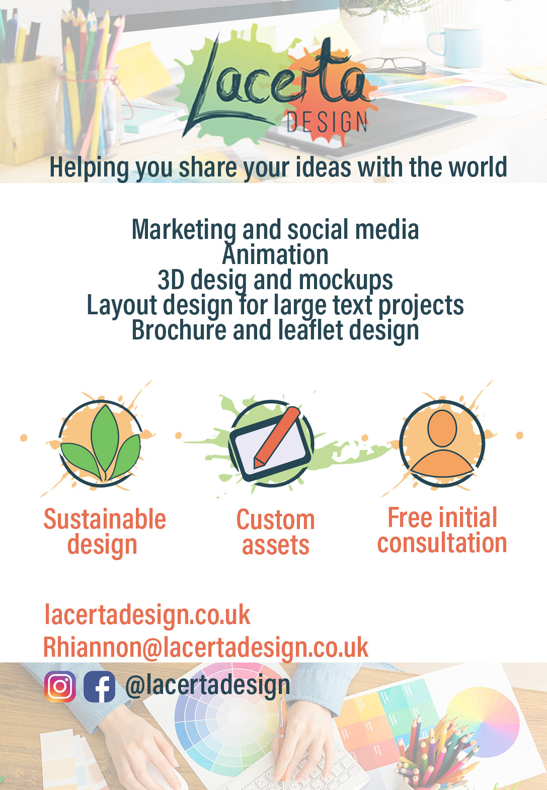
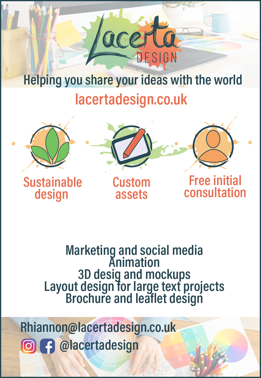
I chose the version with the symbols at the bottom and added the text used on the website to explain more what these symbols and headers meant, before editing it so that it would be more uniform and fit better in this design.
I also moved the email into the footer and kept the website at the top, but larger and more prominent so it was one of the first things to catch the eye of someone looking at the advert.
I chose to use the border around the edge, as when I printed it out to try without this in place on an existing copy of the magazine it blended into the white background of the page and didn't stand out amongst the other adverts. It gives a clear edge for the design and keeps the edges clean when the white parts could blend into the background.

The final step was to play around with the layout of the text so it looked more balanced, moving some of the positions in the services available and also changing the size of the 3 in '3D design' as the font made the letters and numbers different heights. This made it more uniform.
There are some changes I would make to this design, the main one being the addition of a QR code, which I now have and use on my business cards. This makes it easier to access the site for people who see the advert and can simply scan with their smart phones.
The overall design is clear and easy to read and it fits with the company branding. The use of existing assets ties it in with the brand identity and the images continue the style previously created for social media and web assets.