I was given a PDF with information about an online course for creating online teaching resources. The brief was the make it more aesthetically appealing and to make sure that all of the information was included. It was to be used in a presentation and possibly online as a brief outline of the course and information for those considering signing up to it.
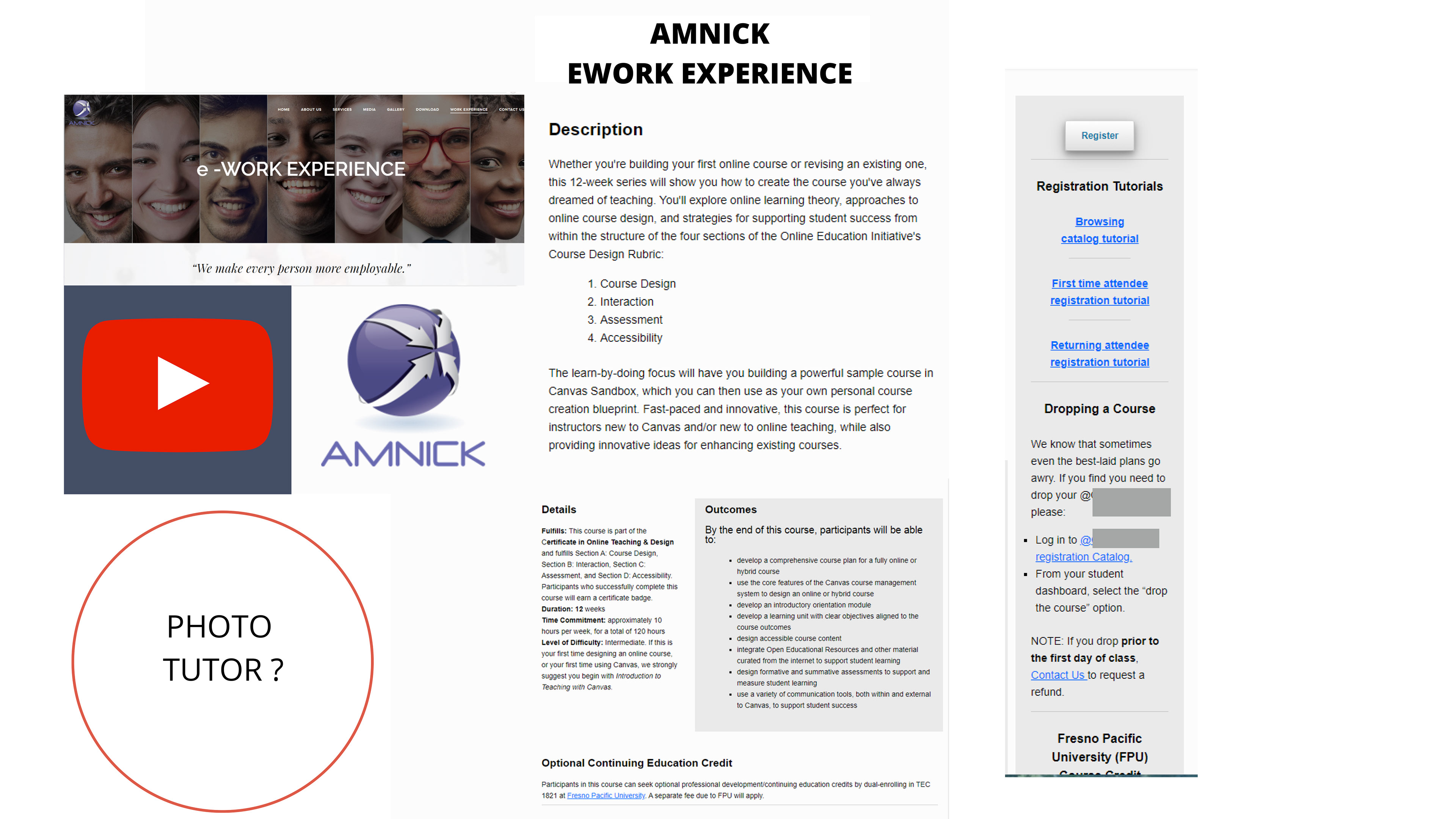
As there is a logo or image using paint strokes, it's hidden behind the Amnick Work Experience one in the PDF, I chose to use that for the main background. I was unsure if all elements of the PDF had to be included, I was not told the relevance of the YouTube logo for example, but to have the final design in A4 format I mainly focused on the information, the company logo and the title of the course.
As this is a work in progress there are some things I will change if the project goes ahead. I would increase the opacity on the boxes so the text is more readable, and move some of the boxes around to make room for any of the elements in the original PDF that weren't included but were needed for the final design.
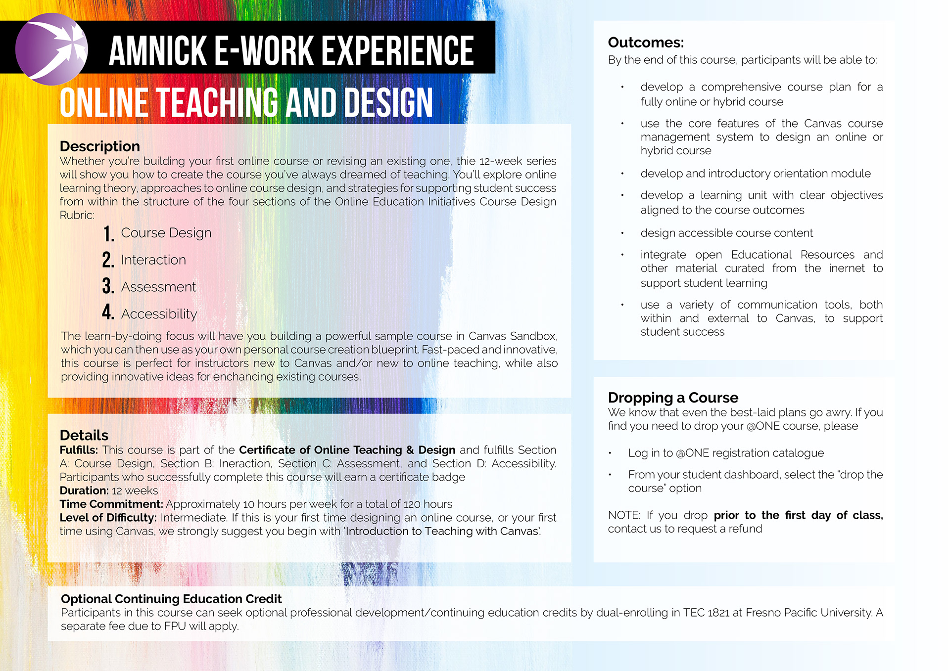
After the landscape design was done I was asked for a portrait version as well for the team to decide which they preferred. This had an even faster turnaround time so I simply included everything in the landscape version and changed the text boxes to fit onto the new orientation.
I feel with the portrait version I had more room to move things around, I could easily move everything down a bit and include some of the other elements in the original PDF, but the fast turnaround and not knowing which parts were relevant meant this was the best way to complete it in time.
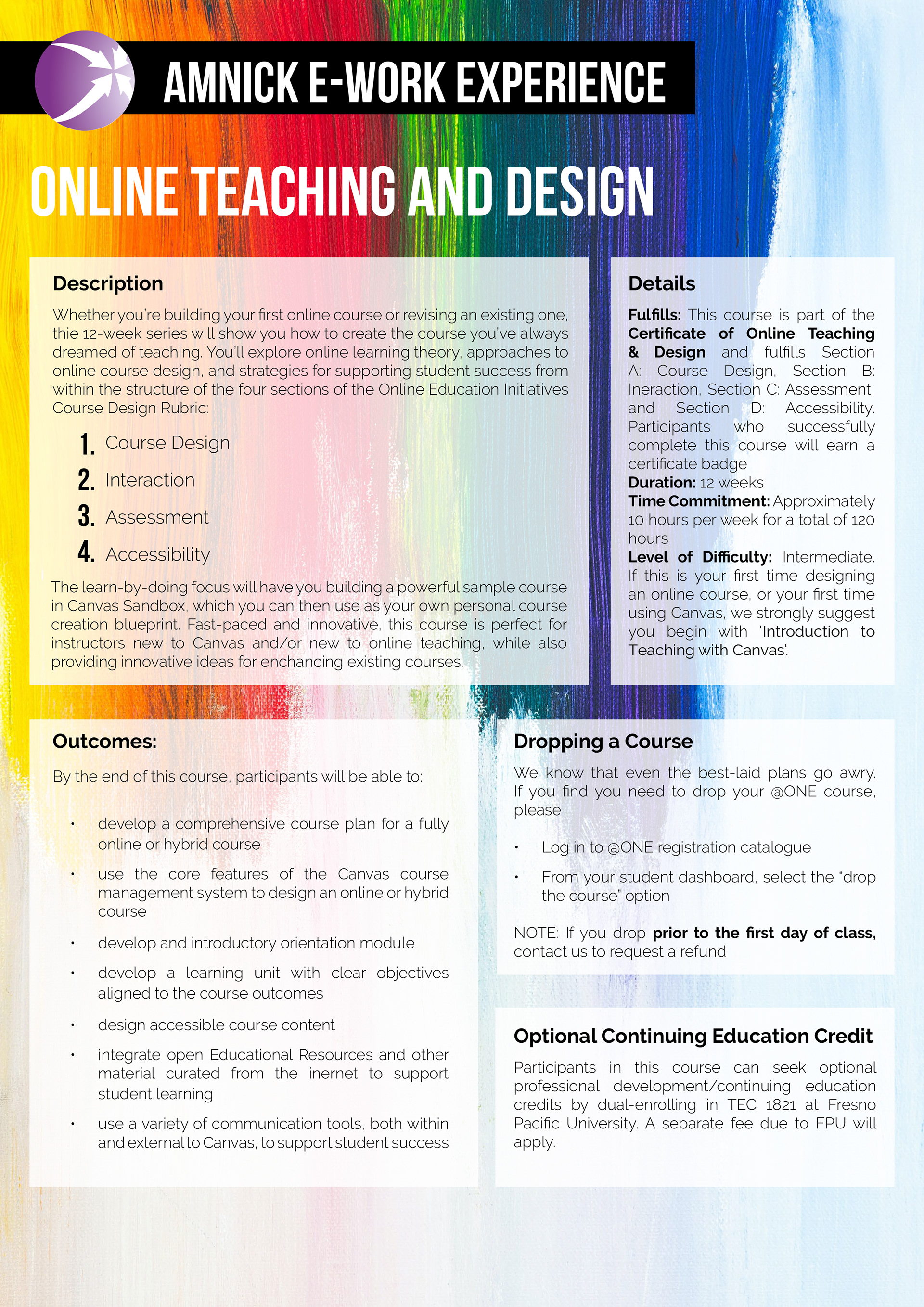
Seeing the landscape and portrait versions next to each other, I definitely feel the landscape one feels better spaced with regular spaces around the edges. The portrait one has a lot of unused space at the bottom in comparison so I'd prefer if that wasn't there, but as I said it's a work in progress so will make changes as the project goes.
I do like the way the brush strokes behind the text look though, and feel this was a good royalty free image to choose for the design as it's eye catching but doesn't take away too much from the text, especially when I increase the opacity behind it.
