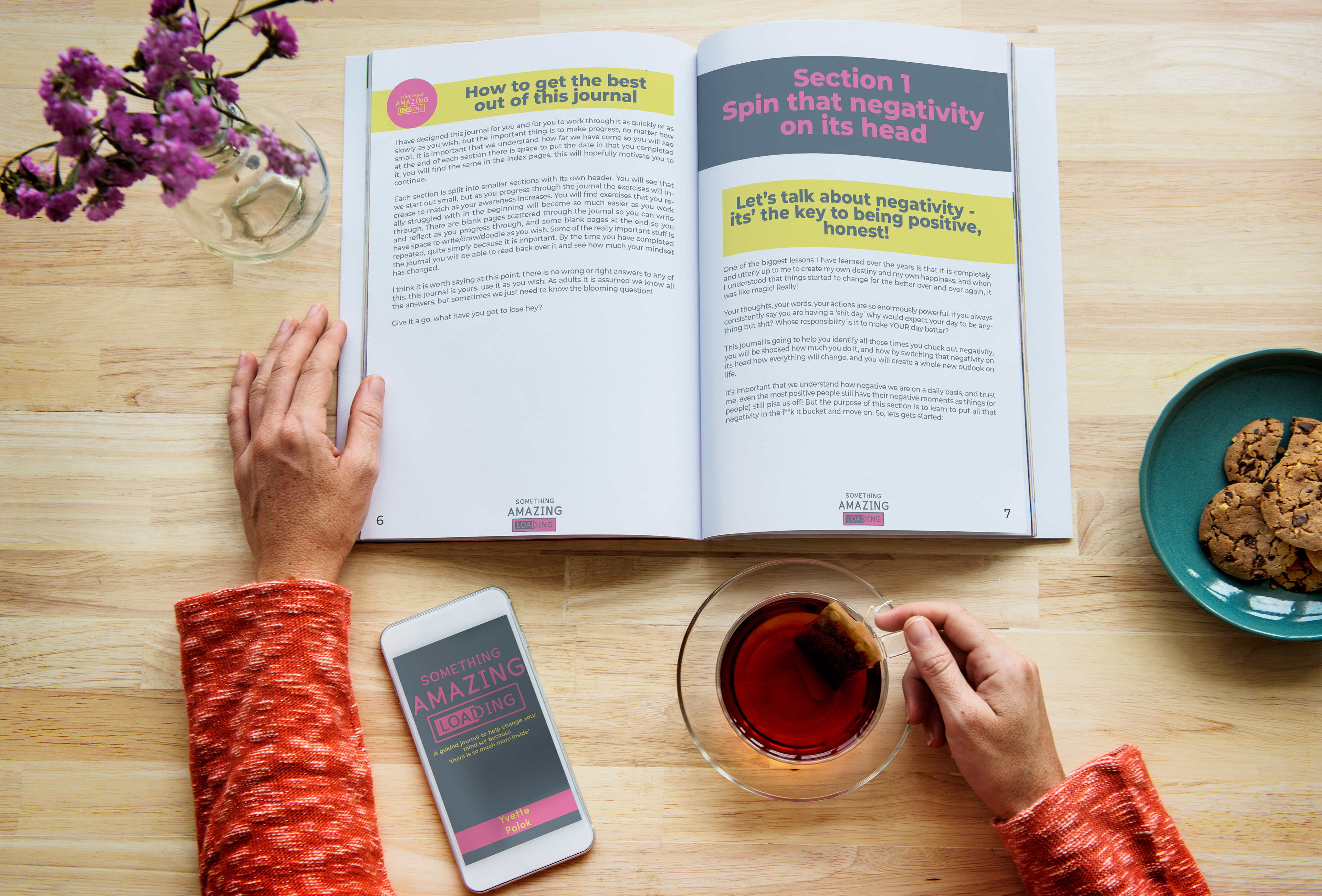
The project for Something Amazing Loading was to create a design for a digital version of a lifestyle journal. It had to be eye catching, use the brand's colours and also be suitable for printing as some pages have areas to fill in.
The final design used the three main colours from branding, the dark blue makes the text softer and easier to read than the harsh black when it comes to screens and areas with tables and large text areas to fill in have a watermarked pale yellow background that also translates into black and white if people were to want to print it off and not use colour.
Every page has elements of design on them, meaning they're not just a plain book layout, they're also eye catching and attractive to write on and use.
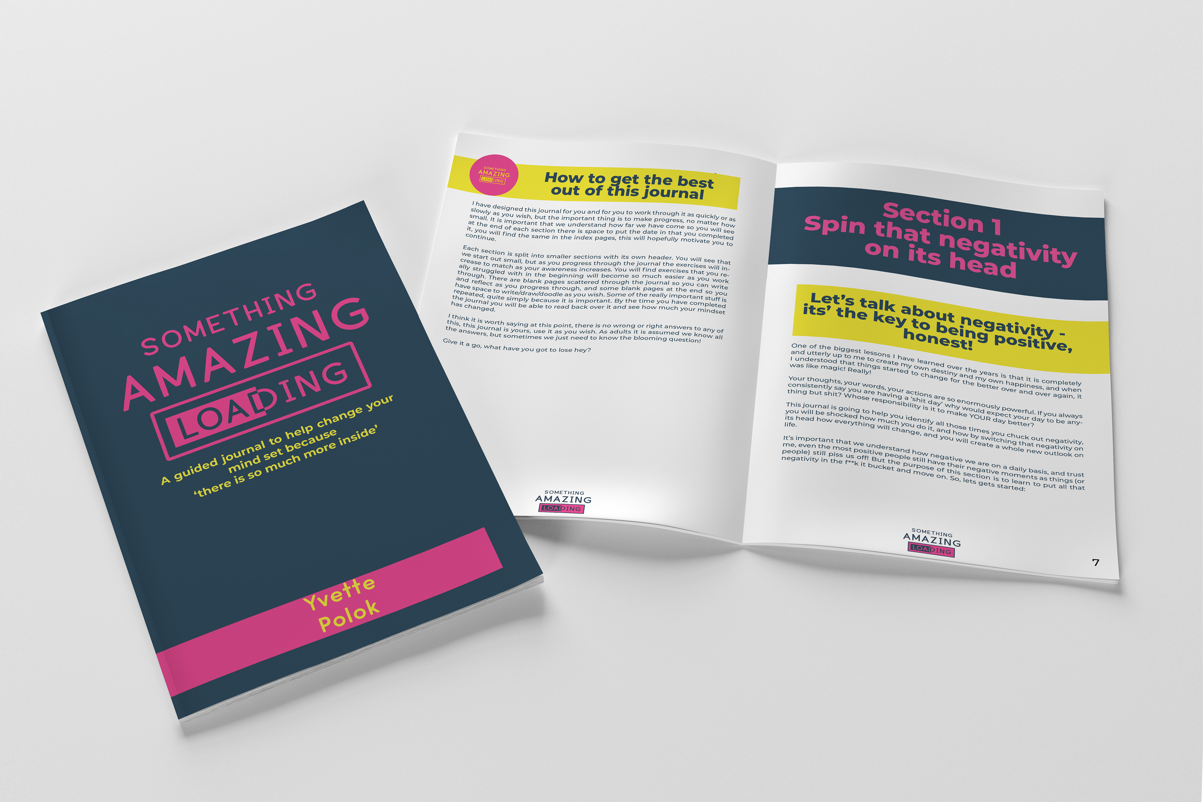
Overall I think the design works well, it's colourful and eye-catching without taking the focus away from the words themselves. Using the logo in the bottom of the page in place of the author's name ties it all together and keeps the branding at the front of the design without it being too over the top and in your face.
Interactive elements were added to the pages where the customer could fill them in, meaning that they can be done digitally as well as when printed off to save paper, they can also be saved and referred back to later in the book or in the future if they want.