The project was to create a 32 page double spread booklet for a student's project. It was to be made in CMYK colour format for print and the final design included the bleed and print marks needed for the printer.
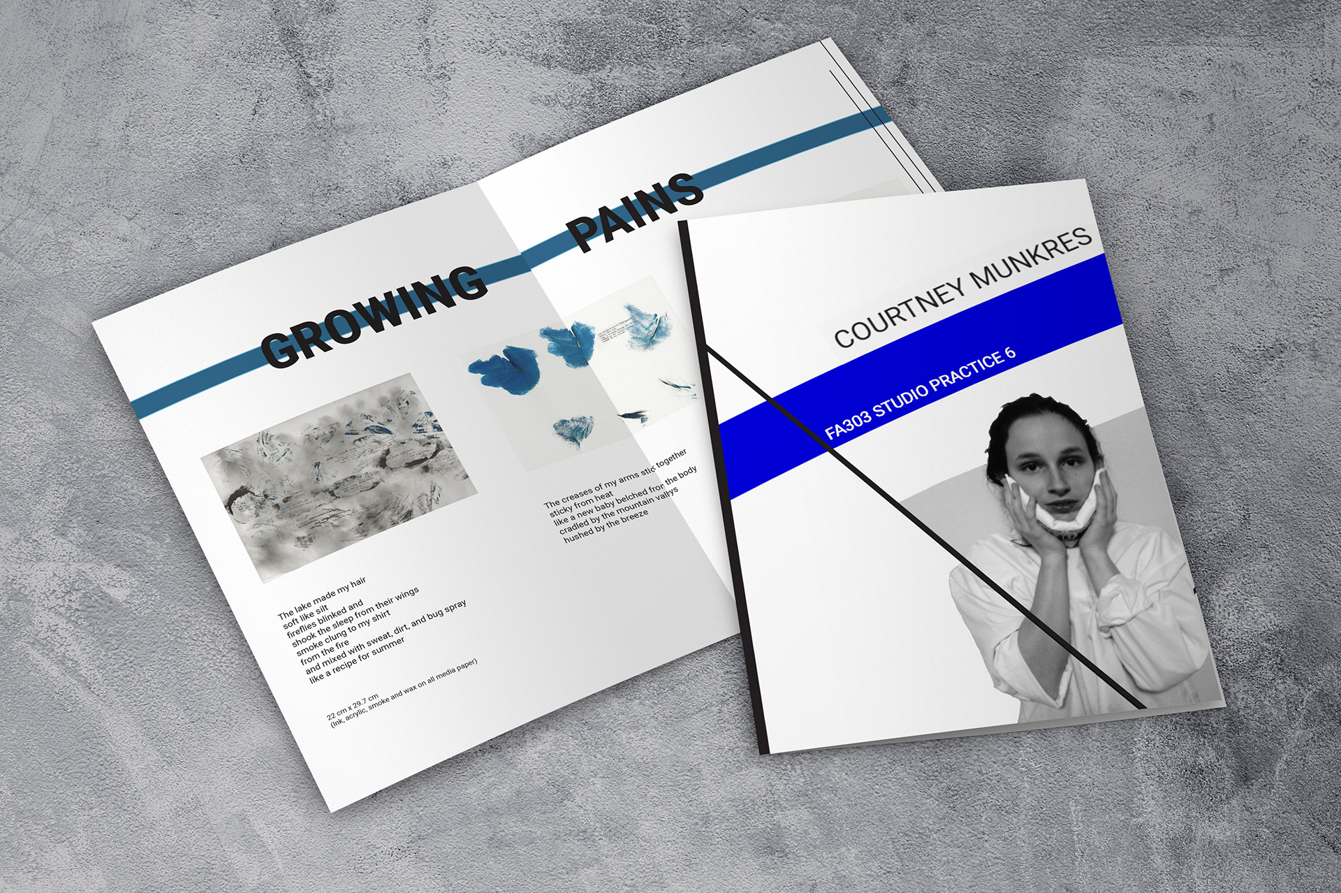
As she already had a design worked out and knew what went on each page the majority of the work was to import it into InDesign to create the project in the format the printer wanted. There were some changes added after the first draft, the blue lines behind the headers and the lines that continued the theme from the cover throughout the booklet weren't in the original design but I feel they add continuity and mean that the final project flows.
There were different background colours to the pages to show the sections of work and clearly define the project summary, the work and the assessment sections at the back. Overall I think the design works well, the text is clear to read and the pieces of work themselves are the focus on the pages where they are displayed.
As the colours chosen were from the pieces themselves inside the booklet, I feel the only improvement would have been to use these on the cover as well, though in print the difference is less obvious.
The dimensions for the project weren't in proportion with A4 mockups, so unfortunately the layout is not exactly the same as in the project, but these mockups for a few of the pages do show the general look of the booklet and the spacing.